Jamovi Data Exploration (Survey Plots)

Mohamad's interest is in Programming (Mobile, Web, Database and Machine Learning). He is studying at the Center For Artificial Intelligence Technology (CAIT), Universiti Kebangsaan Malaysia (UKM).
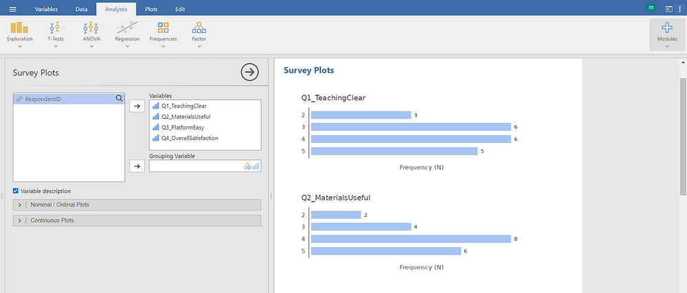
The screenshot displays the Survey Plots module under the Exploration group in jamovi, a statistical software environment designed for visualizing and exploring survey data.
In the left panel, variable selection is configured:
The variables Q1_TeachingClear, Q2_MaterialsUseful, Q3_PlatformEasy, and Q4_OverallSatisfaction are selected from the available dataset. These represent individual survey items, likely measured on an ordinal scale (e.g., 1 to 5 Likert-type responses).
The Grouping Variable field remains empty, indicating no subgroup comparisons (e.g., by demographic or cohort) are applied.
The checkbox labeled Variable description is enabled, suggesting that variable labels or descriptions will be displayed alongside plots if available.
Below these selections, collapsible sections labeled Nominal / Ordinal Plots and Continuous Plots are visible. These allow customization of plot types based on variable measurement level.
In the right panel, under the Results heading, horizontal bar charts are generated for each selected survey item:
Each chart displays response frequencies (labeled “Frequency (N)”) for each possible rating value (e.g., 2, 3, 4, 5).
For example, in Q1_TeachingClear, the frequency of response “3” is 3, “4” is 6, and “5” is 5.
Similarly, Q2_MaterialsUseful shows response “2” = 2, “3” = 4, “4” = 8, and “5” = 6.
These plots provide a quick visual summary of how respondents rated each survey item. The length of each bar corresponds to the number of respondents selecting that particular rating, enabling immediate identification of dominant response patterns — such as skew toward higher ratings (indicating satisfaction) or clustering around mid-scale values (suggesting ambivalence).
This visualization supports exploratory analysis of survey data by revealing distributional tendencies across items without requiring aggregation or advanced statistics. It is particularly useful during initial data review, quality checks, or stakeholder reporting where clarity and accessibility are prioritized.


